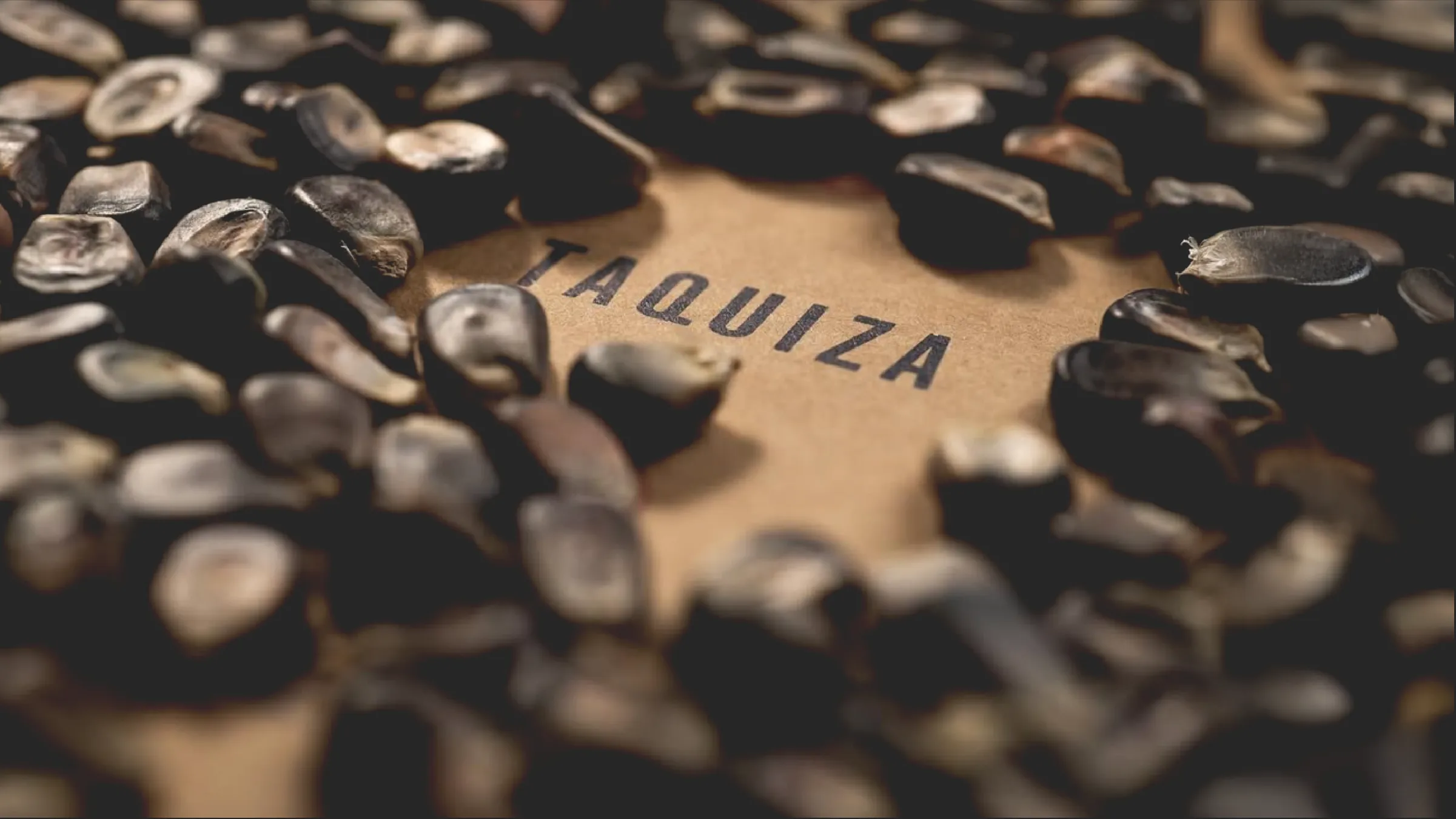
Taquiza
CATEGORY
Restaurant/Bar
SERVICES
Brand Identity
DATE
2026
Overview
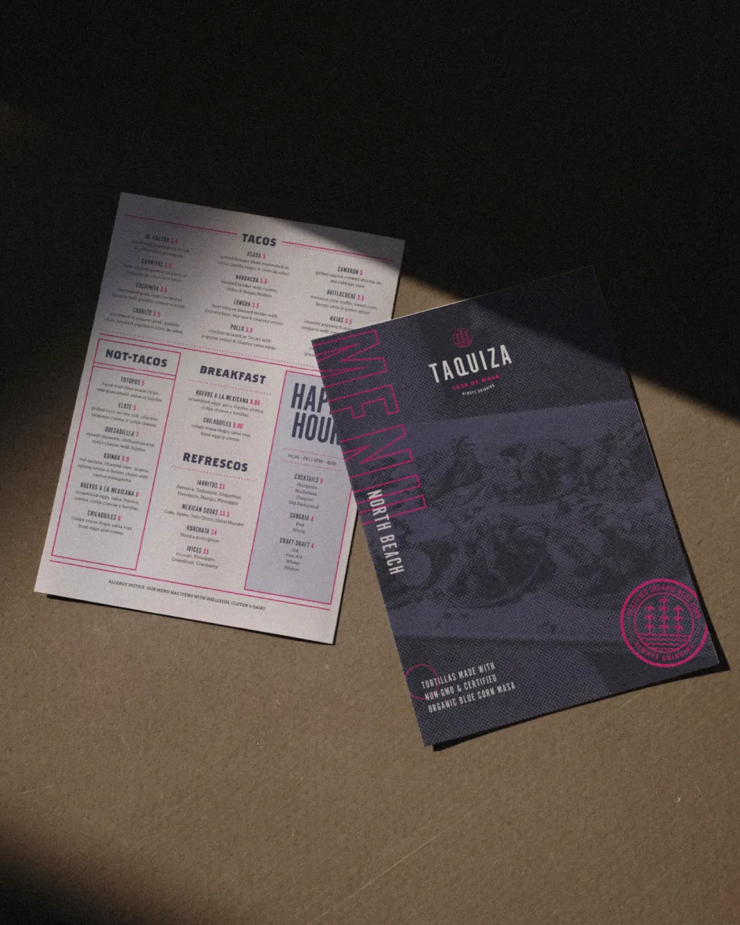
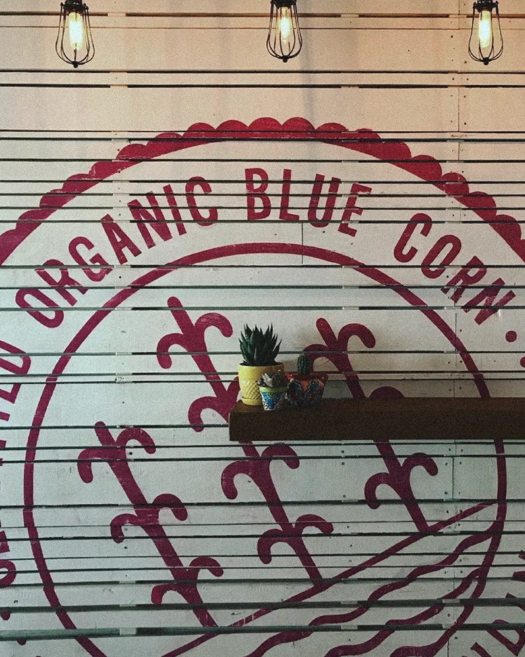
We executed a brand refresh for Taquiza, a Miami Beach taco shop, building on the ritual of handmade blue corn masa tortillas. The work centered on elevating craft and process, translating daily grinding, organic ingredients, and time-honored techniques into a visual system that honored tradition without feeling precious. We developed messaging, identity, and environmental design that positioned Taquiza for expansion while keeping the focus on what made them distinctive: an authentic process in a casual setting.
In collaboration with designer and Illustrator, Noah Levy.

THE OPPORTUNITY
Taquiza had strong street cred and a product rooted in genuine craft, but its brand identity didn't align with its quality. The existing look skewed generic, missing the opportunity to tell the blue corn masa story that set them apart. As they prepared to expand beyond their original South Beach location, they needed a cohesive system that could communicate authenticity, approachability, and craft, without overcomplicating what was fundamentally a neighborhood taco shop.

THE SOLUTION
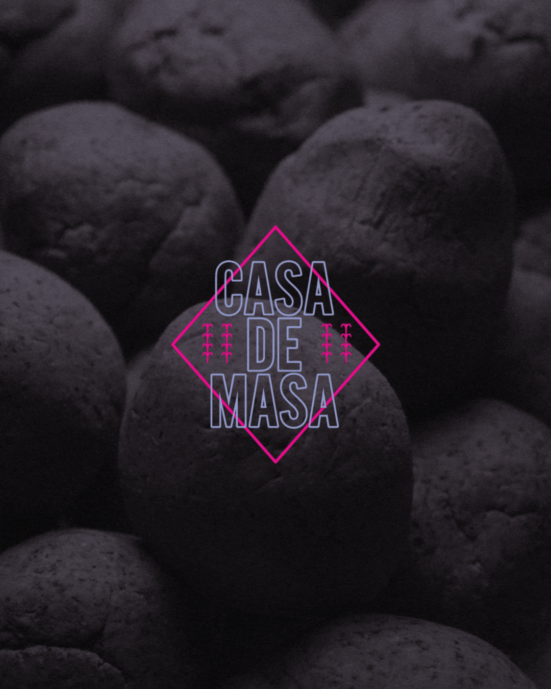
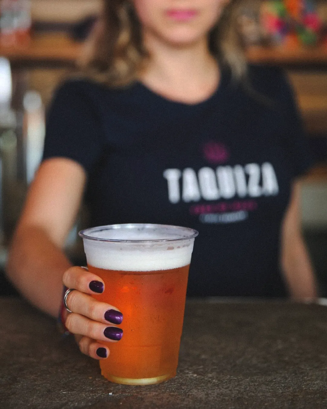
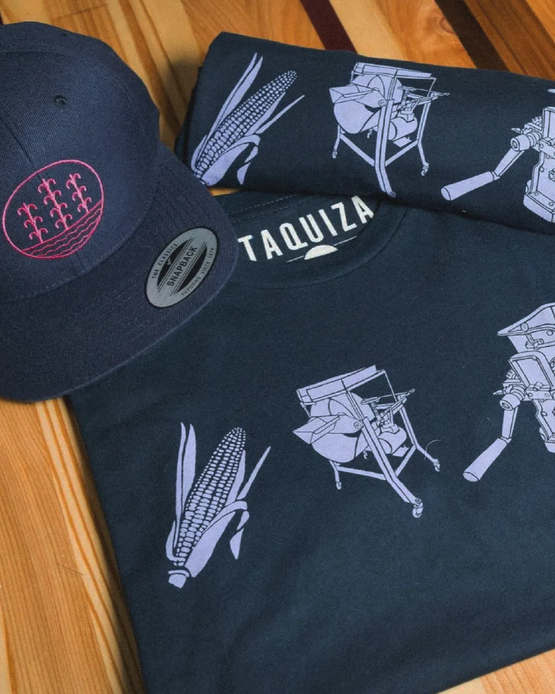
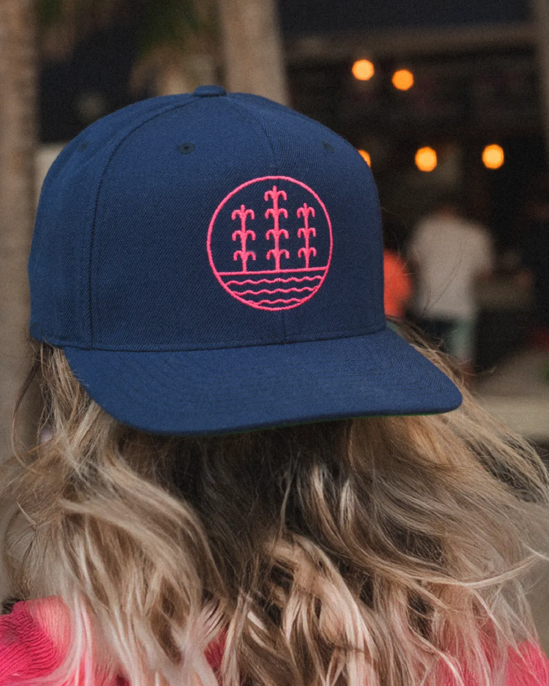
A refined identity system anchored by the tagline "Always Grinding," capturing both the literal masa-making process and the brand's dedication to craft. The blue corn icon became the visual centerpiece, supported by condensed typography, a distinctive masa blue and magenta palette, and hand-drawn supporting graphics (grinders, corn, tortilla presses). We created secondary Southwestern-inspired badges and type treatments that added flexibility for merchandise and collateral. The system worked across signage, packaging, apparel, and interior touchpoints, giving Taquiza a complete brand presence that felt intentional, authentic, and scalable.