Second Mountain
CATEGORY
Service
SERVICES
Brand Identity
DATE
2026
Overview
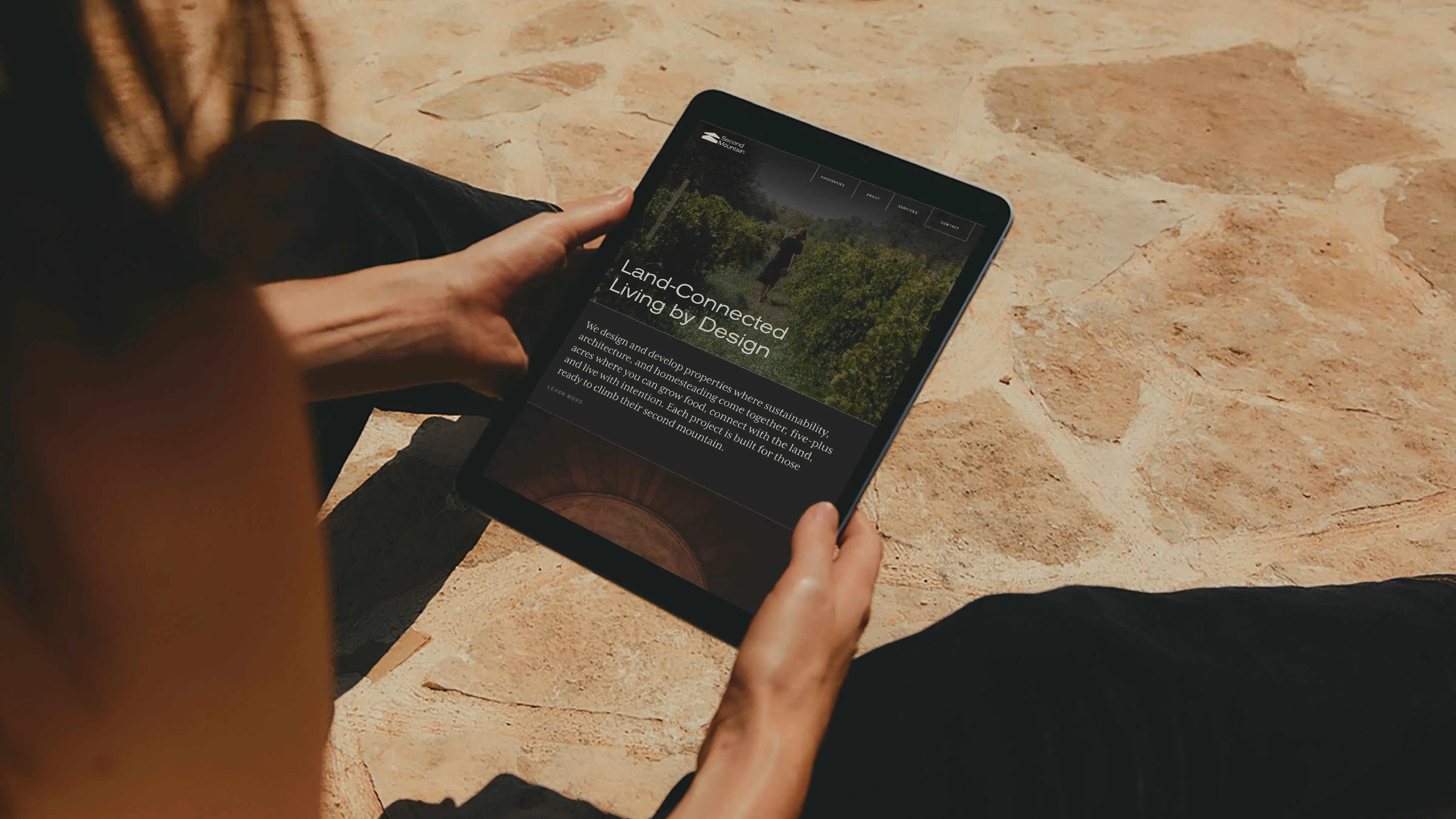
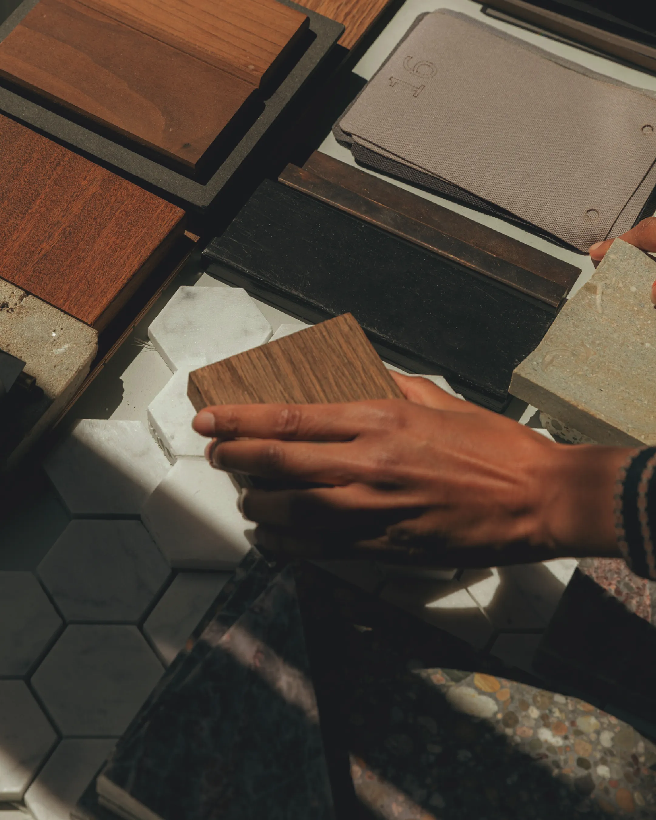
Second Mountain is a property design-build venture creating three-plus-acre homesteads in Western North Carolina. The company needed a complete brand identity that could communicate sophisticated rustic modernism while attracting urban-to-rural transplants seeking authentic, land-connected living. The brand had to work across diverse applications, from architectural presentations to apparel and fire-branded signage, while avoiding homesteading clichés and maintaining the refined aesthetic of Japanese and Scandinavian design influences.
THE OPPORTUNITY
The brand faced several tensions: positioning homesteading as aspirational rather than intimidating, communicating both architectural sophistication and earthy authenticity, and creating visual systems that could scale from embroidered patches to building signage. Most critically, the brand needed to speak to life transformation and courage without feeling preachy, attracting those ready to climb their second mountain while maintaining approachability for beginners.
THE SOLUTION
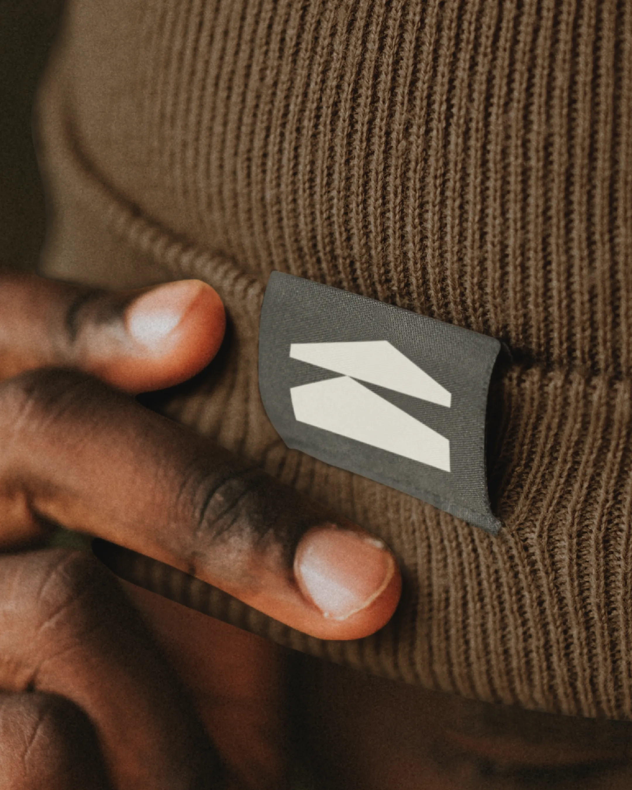
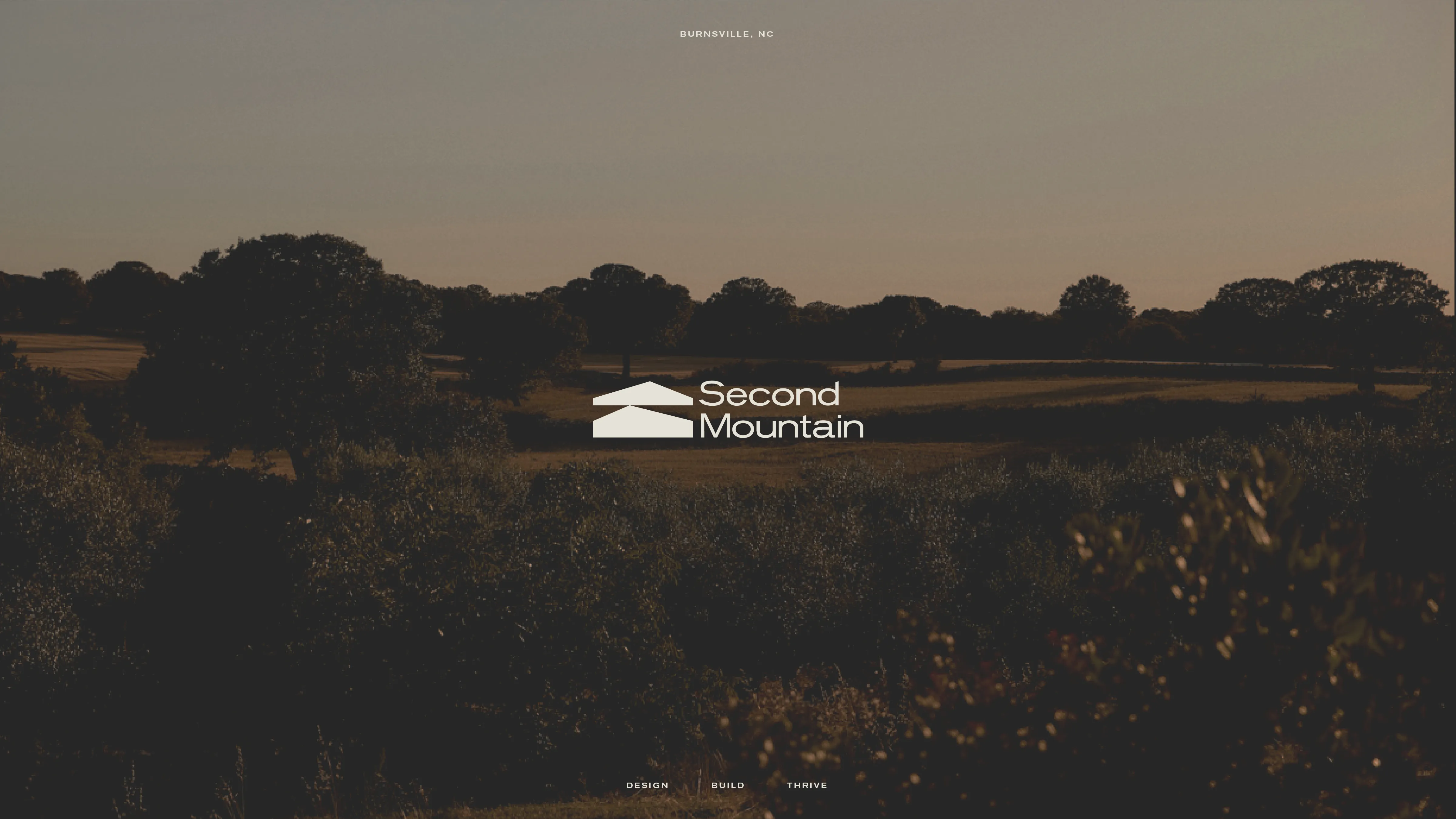
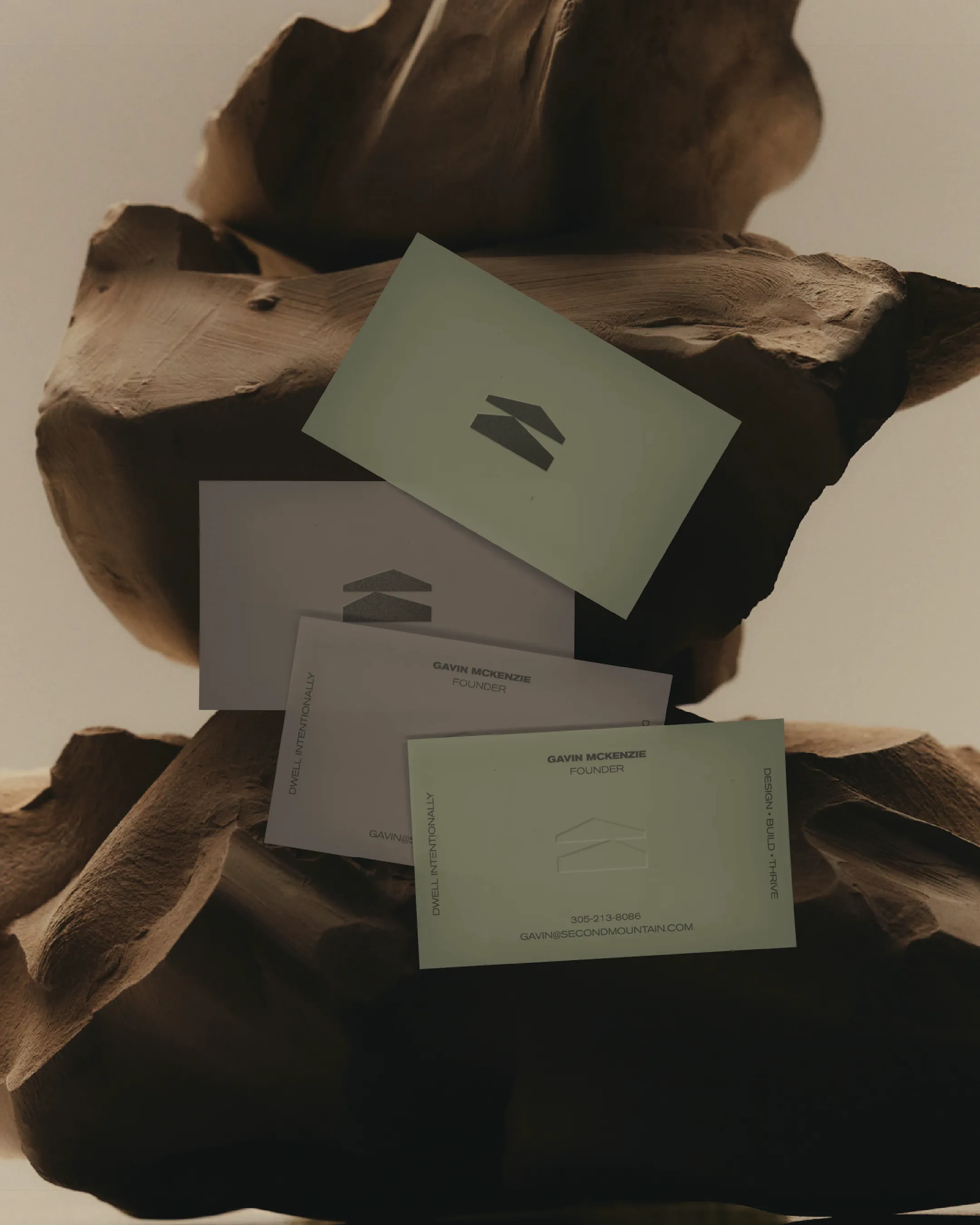
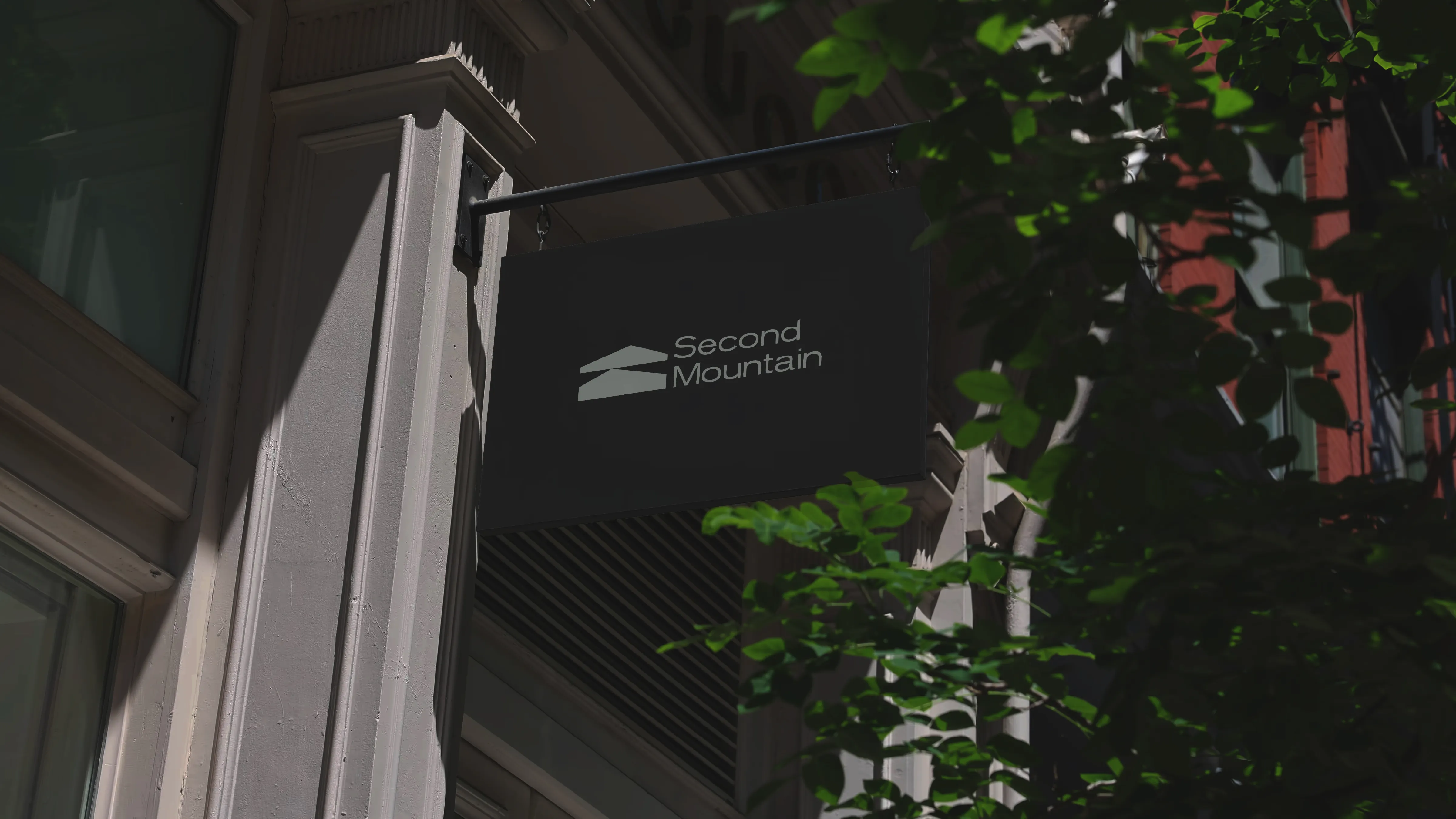
The final identity pairs clean, modern typography with an abstract geometric mark representing both mountain peaks and architectural rooflines, suggesting ascent and structure simultaneously. The neutral, earth-toned palette (moss, sky, rich browns) grounds the brand in natural materials while maintaining sophisticated restraint. Stacked typography accommodates the lengthy name across applications, and the standalone icon works beautifully for stamps, burns, and lifestyle goods. The positioning evolved from potentially restrictive "homesteading" language to the more expansive "land-connected living by design," inviting people to define their own relationship with the land while emphasizing the design-build expertise at the core.